Pixel perfect approach to hardware design is what Apple Inc. is well known for. Steve Jobs came across that he would consider something done when it’s perfect. And it shows as not just the hardware but the software is consumer friendly, without technology being in your face. The graphical user interface looks great and they’re constantly improving the iOS to help make a great mobile experience. Developers love coding for iOS as they provided great tools and APIs to make a simple app look pretty slick out of the box. Which is why I am so disappointed when their own apps are not up to par, at least, in my opinion based on my personal observation and experience with them.
The Apple Store app is a free application for iOS that works on the iPhone and iPad, and lets you order products from their store on the fly. And it supports quick scan which makes the retail store experience even smoother. And if you’re a regular you can turn on quick-buy to help skip a few steps.
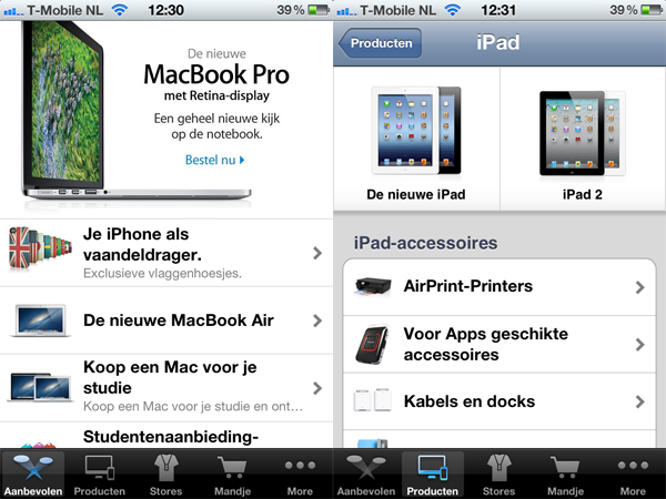
However, from the moment I used it for the first time I felt like it was some sort of clone scam app that doesn’t represent Apple Inc. at all. Maybe it’s a technical limitation so people on old devices can still use it to help them buy new stuff. Honestly, I don’t know. (I’d still show a different UI to a newer device). It really feels like it’s made during the iOS version 2 or 3 days, for iPhone 3 and basically hasn’t received an update since. And I am hoping that after the introduction of iOS 6 it receives an update.
When the app loads there’s no search option, so quickly finding a product (family) is forcing you to figure out if search is hidden in the top (which it is), or if there’s a button in the bottom toolbar to give you a product tree to climb through (there is one). Personally I’d like to see the search option visible at least on the opening screen. In my opinion the point of an app in your pocket is that you can quickly gps, search, check mail, or find all iPod or iMac devices available. But this is just a minor personal opinion. The least of my complaints, to be honest. Especially since the tools are there to get to the stuff you’re looking for.

The images are too small, they are highly compressed, and in most cases the presentation text next to an image is an image itself, with jpeg artifacts and all. The real fonts are rendered poorly, as if an old engine is used. Using Zoom (with three fingers, via accessibility) it’s especially clear.

The first impression when I start the app, compared to loading the apple.com web site, is that it does not come across as a fresh, crisp, sharp looking ‘Apple-y’ app. Remind yourself please, we’re at iOS 5, with 6 in the pipeline.
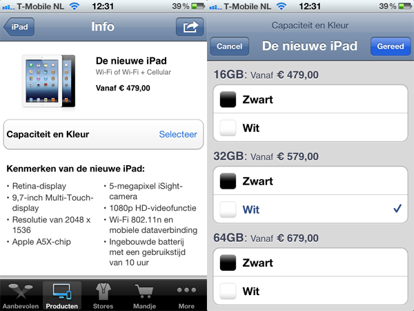
Selecting a product results in a small image with big text next to it, some introduction text below it and then options as buttons, such as quick-buy, or call-apple. However, the expected ‘buy’ button isn’t there. So, you load the app, it’s not on the first page, you have to click products, from where you select something like iPad, from where you select the new iPad, from where you still can’t buy it. So far the quick info, or quick buy experience is already a handful of clicks. And you haven’t selected the colour yet, or capacity, or quick-buy or go to register, etc. Walking into the retail store and saying “I want the 16gb iPad, in white, here’s my credit card” is one line, and the result is one swipe. Hence why I think it’s poorly done, user-experience wise. For a company that introduced the one button mouse, because every click saved is one, this experience doesn’t come across as ‘this is apple’.
Let’s stick with the iPad purchase as an example. Say you want to get it, you have to click on a button to select the colour and capacity. But it’s a separate screen. And the selection is a list, which requires confirmation after making a selection. I don’t quite understand why if it is not a multiple choice question that a submit button has to be selected. I also don’t understand why it’s a list in the first place. You have to choose between ‘current’ and ‘previous version’ when selecting the iPad, and then it switches to a button, that’s a list, from where you make a choice, and then confirm it, and then have to read the screen to double check your choice. Unlike their web site, where you click on the colour (as gui img) and then select capacity. And the choices have been made. And it’s still all the same screen. Why use the app for quick info or quick purchase, if you can just go to the web site for a better experience?
Responsive design has been completely ignored. As has landscape mode. I think on a different sized resolution, a retina display, an iPad, you have different resolutions. And I think it should support landscape, it could show the cart on the left, or a much nicer image. While allowing you to scroll on the right through the options. It simplifies a simple app that made itself not so simple. If there’s no reason to display certain buttons, such as ‘call apple’ or ‘quick buy and other account settings, preferences’, then they should be in the toolbar at the bottom. And the page with the product should just be that product and it’s information and choices. But I constantly see repetitive actions with the same target, but when I actually wanted to just edit my account I had to look around until I saw it listed specifically. Counter intuitive. I think because landscape is ignored (except in the product-gallery view), and responsive design hasn’t been considered, that there’s room to improve the app by a factor of two. I rather see a nice crisp image, with the product title as ‘that is clearly the title’ and properly rendered text below it that introduces the devices. Followed directly by the choices and a ‘add to cart’ button will simplify a product page, takes away clicks, and gives the user what they want.
Personally I do not know why Apple hasn’t required every application submitted to the app store to support landscape mode, but that’s for another blog.
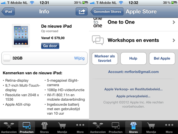
Okay, so we have basically made a choice, and are ready to buy to see what the next step is. However, the button says ‘ga door’ in Dutch, which basically means ‘Continue’, I can only imagine this could mean ‘ok, you know what you want, lets continue and place the order’, but it doesn’t, nor is it clear that THAT is what it indeed means (it doesn’t mean that). What if I want to buy multiple products? A new MacBook Retina, second monitor, and an iPad? Individual orders would not help anybody. So I am glad the continue button doesn’t mean it instantly charges the credit card (phew, because I am just browsing around! And want to see what it all might just cost me, prior to placing the order). Like I mentioned earlier, it should have a purchase or add to cart button on the same page. Rather than a small blue button that reads ‘Continue’, without explaining what it does. At the very least it should read ‘add to cart’.


Another frustration is that if your phone goes to standby because you’re talking about the product with the sales guy or a friend. You go back to the app and it ‘refreshes’ it seems like, and you end up on the parent page, rather than whatever the last page was. I just left it alone for 12 minutes, unlocked the phone again and it loaded the app, I saw the iPad page I was on and it quickly got replaced by the products overview page. Argh. If I go through the motion again, does the cart have 2 iPads now? I don’t even want to test it.
And finally, there is iPad support. But, that’s it. It loads on the iPad, and looks horrible. I haven’t tested it on the Retina iPad myself, but I can only imagine how it goes from horrible to pathetic. The low quality font and images are blatantly clear. Unfortunately. I was hoping for a touch-optimised interface of their apple.com web site in a dedicated app on the iPad. It has an awesome big screen, especially in landscape mode, that should help you show a fresh, crisp, simple, yet informative, and good UX/UI GUI. It’s not.
Again, I think because Steve Jobs and Tim Cook have introduced and explained to their iOS developers that they have created great hardware and software, great tools and APIs, so making great apps for the iOS devices, with support for landscape, iPad screen resolutions. Great font rendering, and intuitive, logical, and friendly user interface building elements, etc. That their own apps should be a great example to demo and show off the devices. They introduce their iWork apps on iOS all proud of the interface and the way it’s simple and just works, how garageband and iMovie are as a GUI innovating and give a wonderful experience. And I agree, which is why I hope that they apply that to all their apps.
This reminded me of a Dell web site app for Android. And that means I don’t want to use it. And I hope my nitpicking and frustration as I expressed in this article is taken as constructive criticism, rather than trolling. Because I try to explain my experience, my opinion, and that I have passion for the platform and really wish I had fun playing with the app on the iPad, being provoked to buy the latest, just because it’s cooler than what I already have. Apple, make this blog article outdated after iOS 6 by releasing an update to the Apple Store app.
[Update] A day after my article there was an update, but nothing I pointed out has been address.