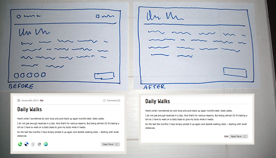
Some time ago a friend on IRC suggested to remove the clutter from the frontpage of my blog, to draw more attention to the content. I agreed and have been thinking about it for a while. Today I opened up Things.app and saw the item still pending and decided to get my sharpie and paper out. And give it a try.
What I have done is remove what is not important. As the full article itself will have all these elements already. For example, the comments counter, the full page already has this, and actually links to the comments below an article. Another example are the social buttons. Why link them? People should read the full article before submitting it to social directories or social bookmark pages. The full article has them still of course.

First, I got paper out and tried a few designs and didn’t like it. Then I went drastic and removed everything that is not content. And that’s basically what I went with.
The title got pushed up, the horizontal line added below it. The comments removed. The date removed. And the edit button moved to the bottom. And the read more button left in it’s place; so it’s recognizable still and gets more attention. And the content intro text is left in place too.
The result is a title with a line below it. And the intro text, and a button to read more.
While minor change, it’s an important one. It allows more focus to be on the actual content, and there’s less clutter on the frontpage. And it’s less overwhelming for newcomers. And the full article page has these details that are removed. Making it feel more feature-rich. And under the engine there’s less PHP to run, less MySQL queries, and less HTTP calls. The page (while probably not noticeable) will / should load a bit faster and uses less traffic.